
 Mark · ink on paper
Brand ID
Prompt, then site.
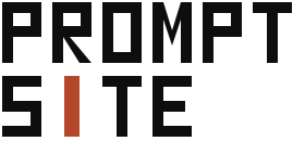
The identity is built, not typeset. A command chevron and a live cursor. The I in SITE is the same slab — you don’t edit a CMS, you type the change.
Lockups
Mark, wordmark, full lockup.
Use the lockup in navigation. Use the mark alone at small sizes, app icons, and favicons. Never redraw the letters in another typeface.
Mark · ink on paper
 Mark · inverse
 Wordmark
 Lockup · inverse
Colour
Ink, paper, rust.
Three colours do the work. Rust is for the cursor, live status, and primary buttons. Don’t tint it.
Ink
#0E0E0E
Paper
#F0EEE8
Rust
#B4472A
Terminal
#101412
Type
Rounded sans, nothing bookish.
Talk it
into shape.
Nunito for headlines. Nunito Sans for reading and buttons. Soft terminals, no serifs, no script.
01 — Client area — Describe a change — Send
Voice
Direct, specific, unhurried.
We sound like a studio that ships files, not a SaaS that ships features. Short sentences. British English. No “leverage”, no “delightful”, no WordPress metaphors.
- Say “static site”, not “headless CMS”.
- Say “ask in the client area”, not “submit a ticket”.
- The product is the conversation plus the live files.
Use
Keep the geometry honest.
Do
- Keep the rust I. It is the brand, not decoration.
- Give the mark at least a quarter of its height as clear space.
- Use inverse lockups on Terminal and photography.
Don’t
- Don’t set PromptSite in Nunito as a substitute logo.
- Don’t outline, bevel, or recolour the cursor.
- Don’t squeeze the wordmark or swap the chevron for an arrow emoji.